Trends & cross-metric analysis
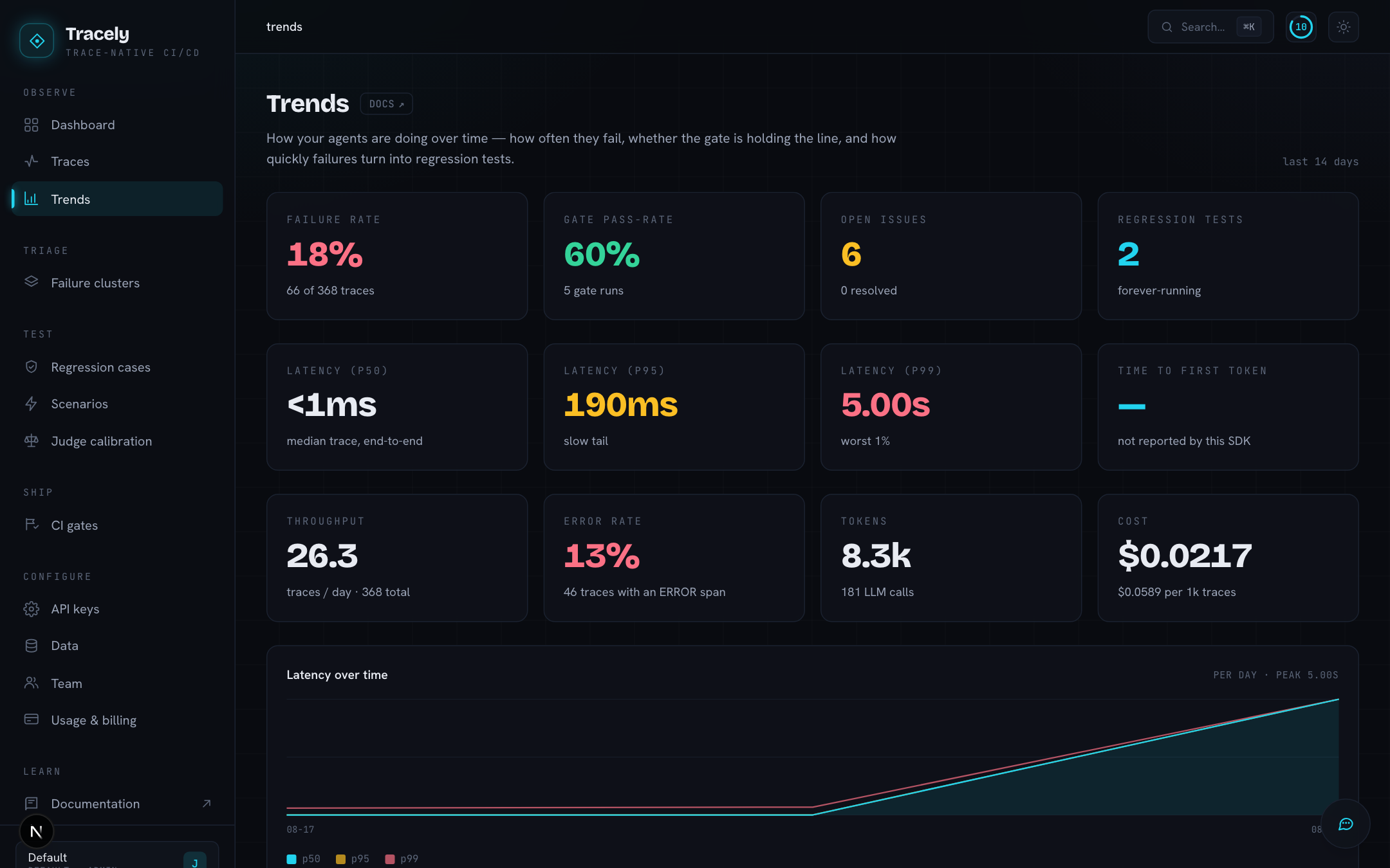
Trends is the over time view of the workspace, for the last 14 days (30 for cost). Everything on it is derived from traces and scores — nothing is entered by hand.
Stat cards
| Card | Meaning |
|---|---|
| Failure rate | failing traces ÷ all traces in the window (one verdict policy: a FAIL on a non-advisory evaluator) |
| Gate pass-rate | passed gate runs ÷ all gate runs |
| Open issues | failure clusters not yet resolved or ignored; the sub-line counts resolved ones |
| Regression tests | promoted cases; the sub-line is the mean time from a failure landing to it becoming a test |
Operations
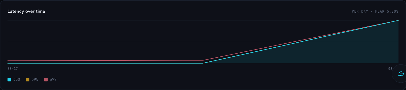
Latency p50 / p95 / p99, time to first token, throughput, error rate, tokens and cost, then latency over time per day, by model (latency of the generation spans themselves) and the slowest operations by p95 across every span. Cost is derived from model name × token counts through a price table; you never trace a price.
Traces & failures · gate runs
Two bar charts: traces per day with the failing ones highlighted, and gate runs per day split passed / failed.
Judge column cost
What each LLM-judge column has cost to run over the last 30 days — the calls are priced from OpenRouter when reachable, otherwise from a static table. This is where you notice a step-level judge quietly grading thousands of spans; the fix is a sampling rate or a narrower target on that column (Add Column).

Cross-metric analysis
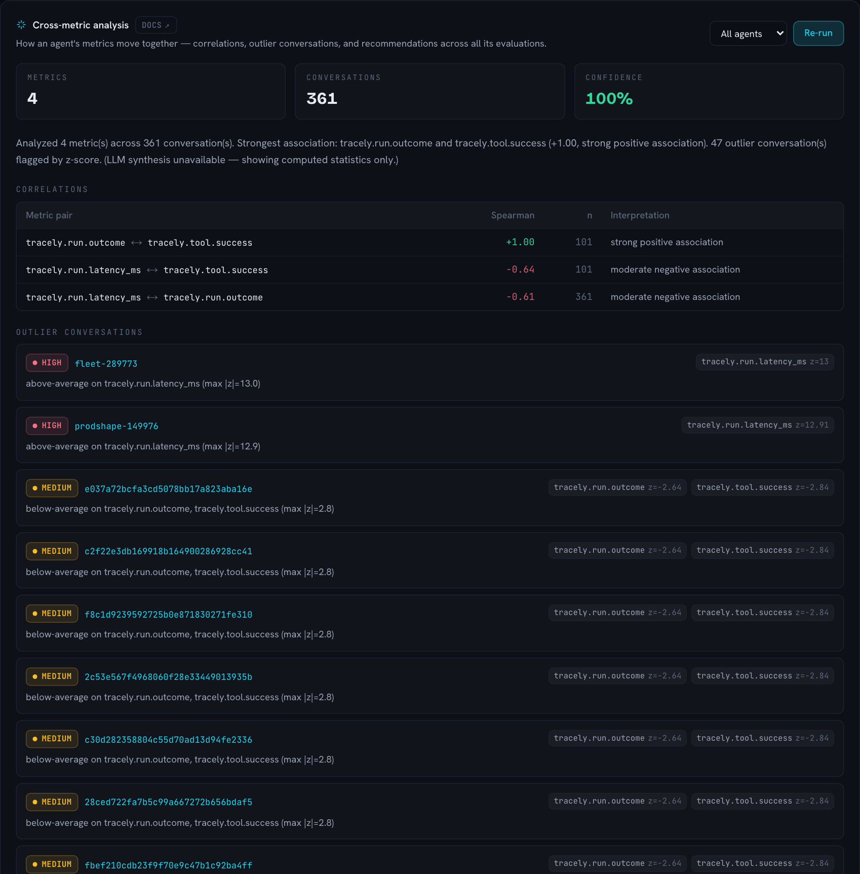
Every other panel looks at one metric at a time. This one asks what the metrics say together: do they move with each other, which conversations are statistical outliers on them, and what should you do about it.
What to do
- Pick an agent (or All agents).
- Click Run analysis. The latest stored analysis for that agent is shown on load; Re-run recomputes over the current scores.
- Read it top to bottom: the headline counts, the summary, then patterns → correlations → outliers → recommendations.
- Export Markdown to paste it into an issue or a PR.
How it works, exactly
The analysis runs in four steps. The first three are deterministic Python; only the last one uses a model — and it is not allowed to touch the numbers.
1. Gather the scores. Tracely takes the agent’s most recent traces (up to 2,000), and collects every online-evaluation score attached to them at every level — step, message and conversation (conversation-level scores carry no trace id, so they are fetched through the thread). Each score becomes a row: conversation_id · metric_name · value. Text-only results (a text column, or a json column without a numeric score) have no value and are skipped.
Alongside the scores, four operational metrics are read straight off the same traces and join the matrix as first-class metrics: ops.latency_ms (per-turn wall clock), ops.tokens (per-turn tokens), ops.tool_errors (errored tool calls per turn) and ops.turns (turns per conversation). That is what lets the analysis connect quality to cost and speed — “the low-groundedness conversations are the slow, tool-error-heavy ones” is only findable with both halves in one table.
2. Build the matrix. Rows collapse into one table — one number per metric per conversation. Where a metric produced several values for the same conversation (a step metric over many tool calls, a message metric over many turns) they are averaged, so a 10-turn conversation and a 1-turn conversation each count once. Only conversations are compared, never individual turns — that is why the panel counts conversations analysed.
3. Statistics. Two computations over that matrix:
- Spearman correlation for every pair of metrics. Spearman is a rank correlation: it asks “when conversations rank high on A, do they rank high (or low) on B?”, which is robust to a metric’s scale — a 0–1 score and a latency in milliseconds compare fine. Ties get averaged ranks. A pair is only reported when at least 3 conversations carry both metrics, and it is dropped when one side is constant (every conversation scored
PASS) because a correlation with no spread is undefined, not zero. Pairs are sorted by the strength of the coefficient. The n column is the number of shared conversations; Tracely reports that instead of a p-value on purpose — a real p-value needs more than it would be honest to fake, and n tells you how much to trust the number. - z-score outliers per metric. For each metric, a conversation’s value is compared to that metric’s mean and standard deviation across all conversations:
z = (value − mean) / std. Anything beyond |z| > 2 is flagged; the worst z a conversation hits grades its severity — high at 3 or more, medium at 2.5, low below. Flags are grouped per conversation, so one row says “this conversation is 13 standard deviations above average on latency” with a link straight to it. A metric needs at least 2 conversations and a non-zero spread to produce outliers.
4. Synthesis. The matrix summary (mean / min / max / std per metric), the correlations and the outliers are handed to the model on the workspace’s OpenRouter key with one instruction: interpret, don’t invent. It returns patterns (cross-metric observations with the evidence they rest on), a plain-language interpretation per correlation, a reason per outlier, recommendations, a summary and a confidence (0–1, lower with few conversations or few metrics). The reply is then merged back onto the computed statistics: the coefficients, n, z-scores and severities you see are always the Python numbers, and the model’s text is attached where its metric pair or conversation id matches. A coefficient cannot be hallucinated into the table.
No key, no credits, or a failed call? The analysis still succeeds: the same correlations and outliers, a templated summary, rule-based recommendations (investigate pairs with |ρ| ≥ 0.4, review the flagged conversations) and a confidence of min(1, conversations/40) × min(1, metrics/4). The footer then reads stats only instead of a model name, and the Patterns section is absent. Add an OpenRouter key (or credits) under Settings → API keys and re-run to get the synthesis.
Reading the result
- Metrics / Conversations — the size of the matrix. Four metrics over 300 conversations is a solid analysis; two metrics over eight is a hint.
- Confidence — green at 66 %+, amber at 33 %+, red below.
- Correlations — the coefficient is coloured by strength: |ρ| ≥ 0.7 strong, ≥ 0.4 moderate, below that faint. Positive means the metrics rise together, negative means one rises as the other falls. A strong negative between
tracely.run.latency_msandtracely.tool.success, for instance, says slow runs are the ones whose tools failed — retries and timeouts, most likely. - Outlier conversations — the severity badge, the conversation id (click it), the reason and a chip per affected metric with its z-score.
- Recommendations — concrete next steps. The usual ones: add a structural evaluator for a mechanism two metrics keep pointing at, open the outliers, or promote one into a regression case.
Correlation is not causation, and a correlation of exactly +1.00 usually means two metrics measure the same event (a tool error makes both tool success and run outcome fail). Treat it as confirmation that the signal is coherent, not as a discovery.
Analyses are stored per agent, and each one snapshots its per-metric means. When a previous analysis exists for the same agent, the panel opens with a Since last run table — each metric’s previous mean, current mean and delta, coloured by whether the movement is an improvement (for ops.latency_ms and ops.tool_errors, down is good). The shifts are also handed to the model, so the summary says what moved, not just what is.